
Building Harmony
How We Crafted Our Crayon Design System from the Ground Up
team
Lead Product Designer
UI/UX Designer
1 Engineering Team
SKills
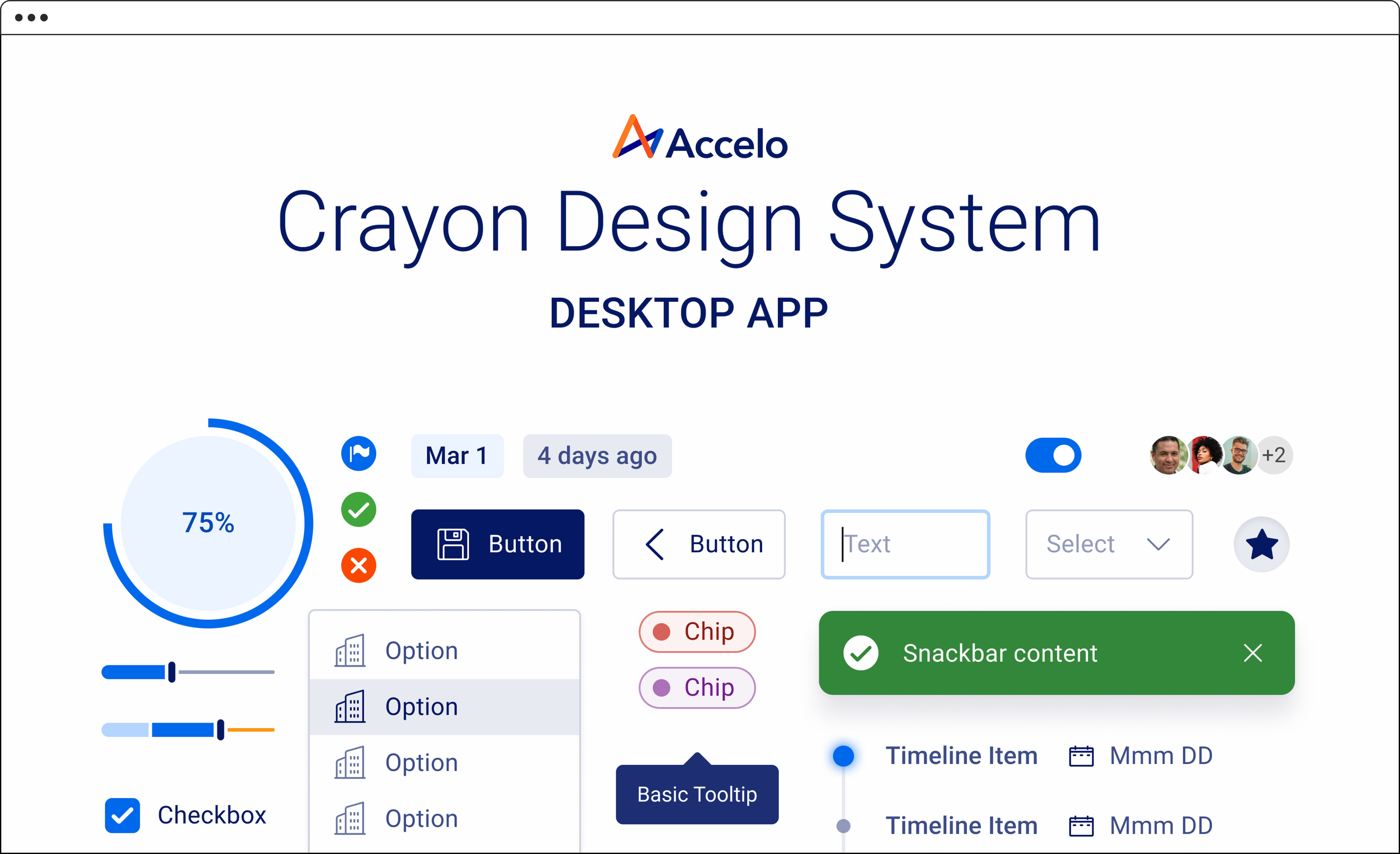
Design System
UI Audit
Cross-functional Team Collaboration
project duration
Initial Build (2023)Support (Q3 2024 - Ongoing)
process

Audit & Research


Defining the Foundation

Component Library

Documentation

Collaboration
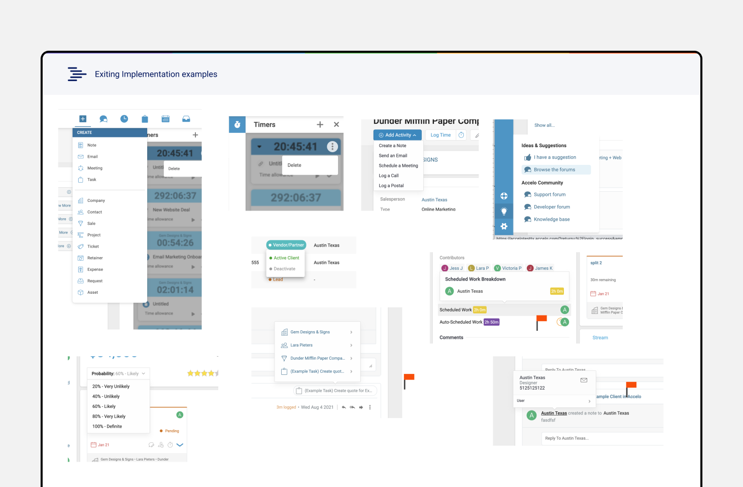
Screenshots from our legacy screens with inconsistent UI patterns.
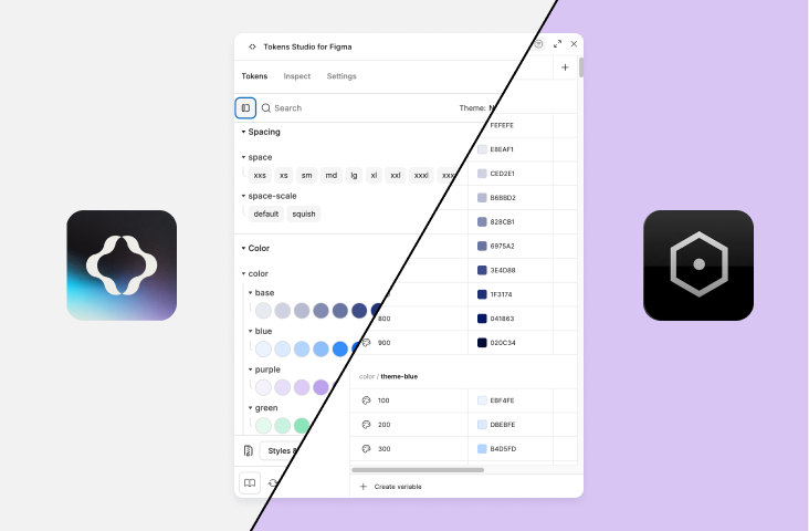
Our token setup from Tokens Studio (third party plugin) that we migrated to Figma Variables (built-in Figma feature) later on.
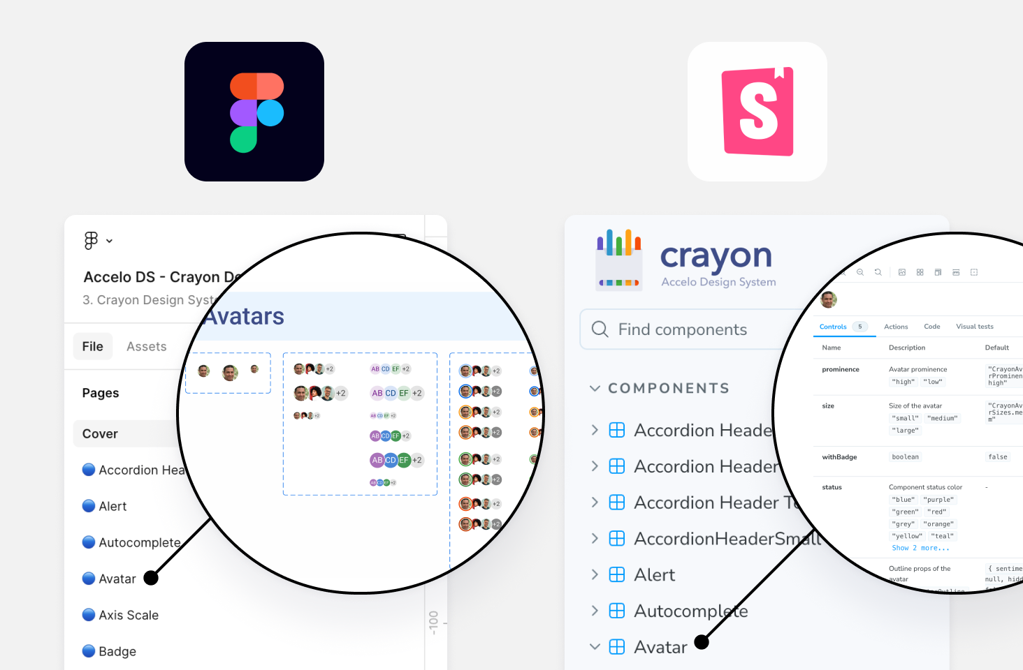
Figma components for design use and Storybook components for developer consumption.
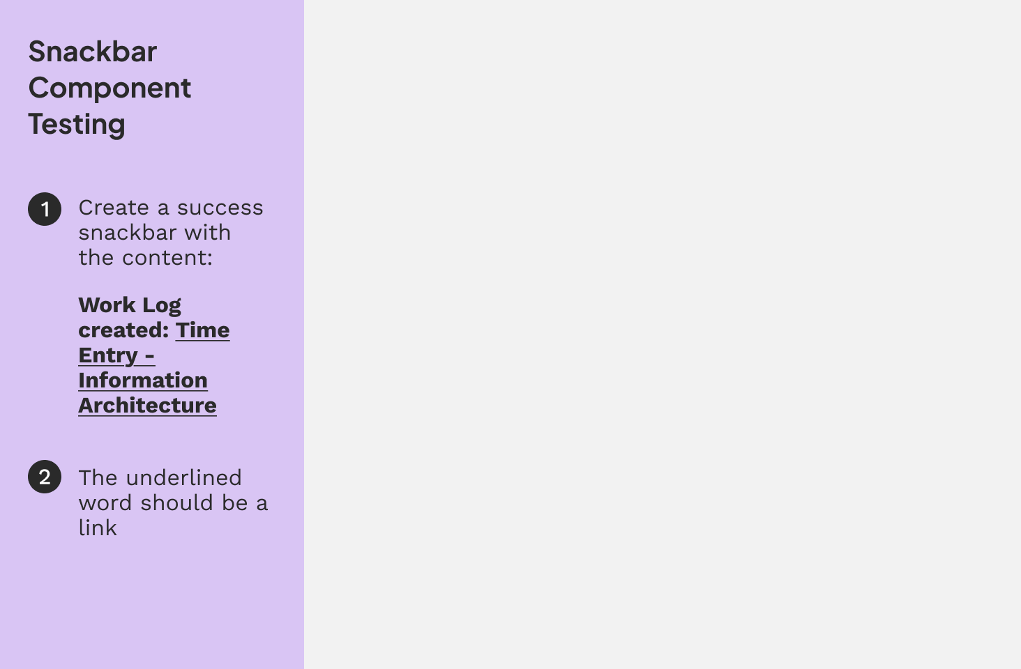

An example of a Component Testing Session where designers test the components for bugs and suggest ways for improvement.
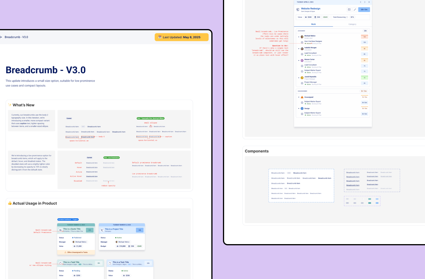
Example of a component handoff document
impact
Helping Developers Build More Consistently
As part of a survey to understand developer opinions on the design system, 7 out of 11 developers shared that it effectively supported their project needs. Several noted it helped them code more efficiently and maintain consistency across both UI and code. Despite limited resources, support from the design system team was rated as excellent and issues were consistently addressed when raised.
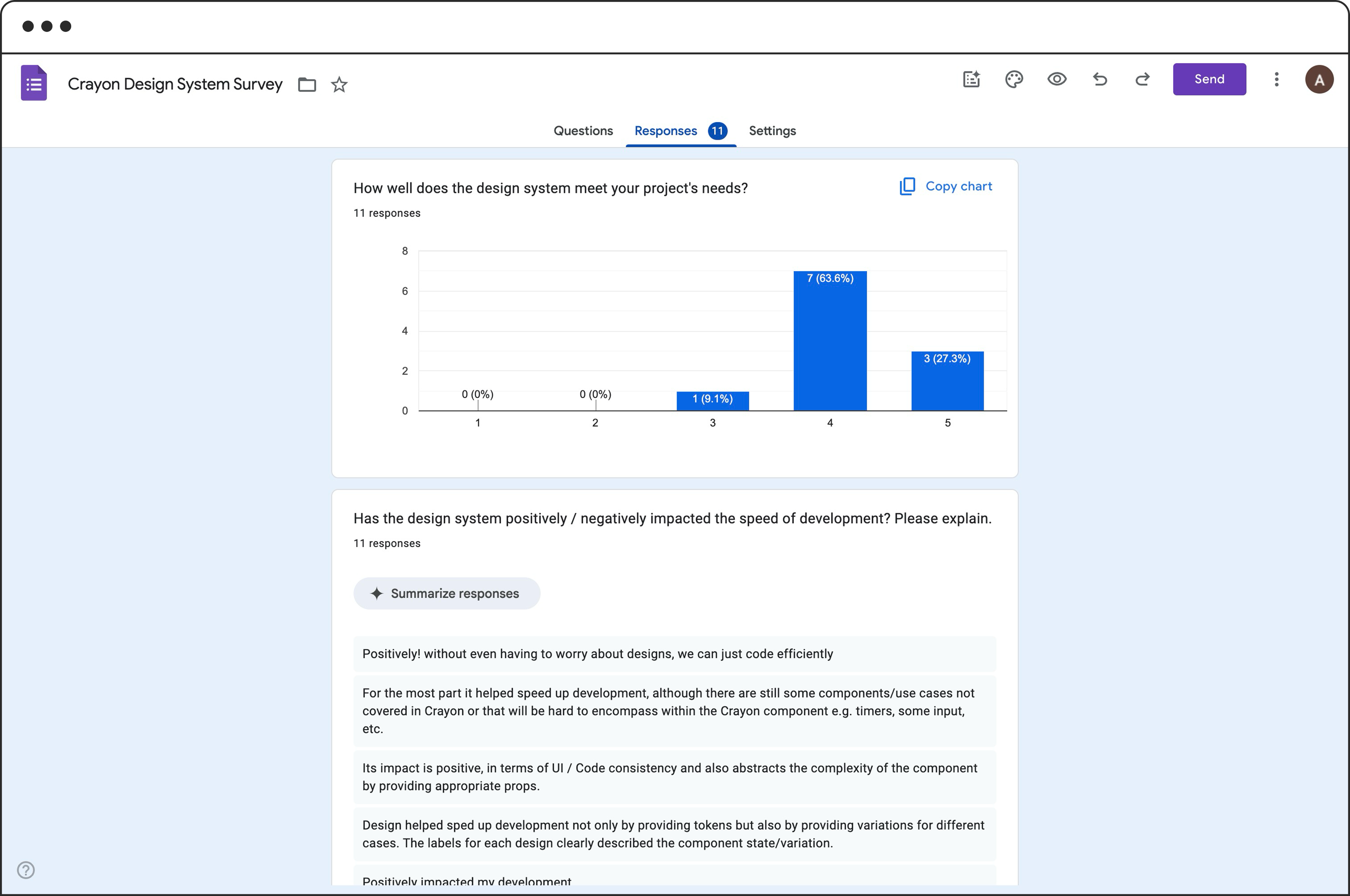
A quick snapshot of the Crayon Design System Survey I sent to developers to better understand how they feel about using the components in their workflow.
8.36/10
Improving UI Consistency
Average dev rating on the effectiveness of the designs system in improving UI consistency
5/5
Support


Developers rated the support for the design system as outstanding.
4/5
Overall Quality

Developers gave the design system high marks for overall quality.

Previous Case Study
Next Case Study


