
Breaking It Down to Build It Better
Our Multi-Phased Approach to Improve our Scheduling Feature
team
Lead Product Designer
UI/UX Designer
Product Manager
2 Engineering Teams
SKills
Wireframing
High Fidelity Design
Prototyping
Dev handoff
project duration
3 months
solution
Phase 1: Tentative Scheduling at the Quote Stage
We introduced the ability to add tentative schedules even before a project is confirmed, right at the quoting stage. This gave teams visibility into potential workloads earlier, helping them better prepare and allocate resources.
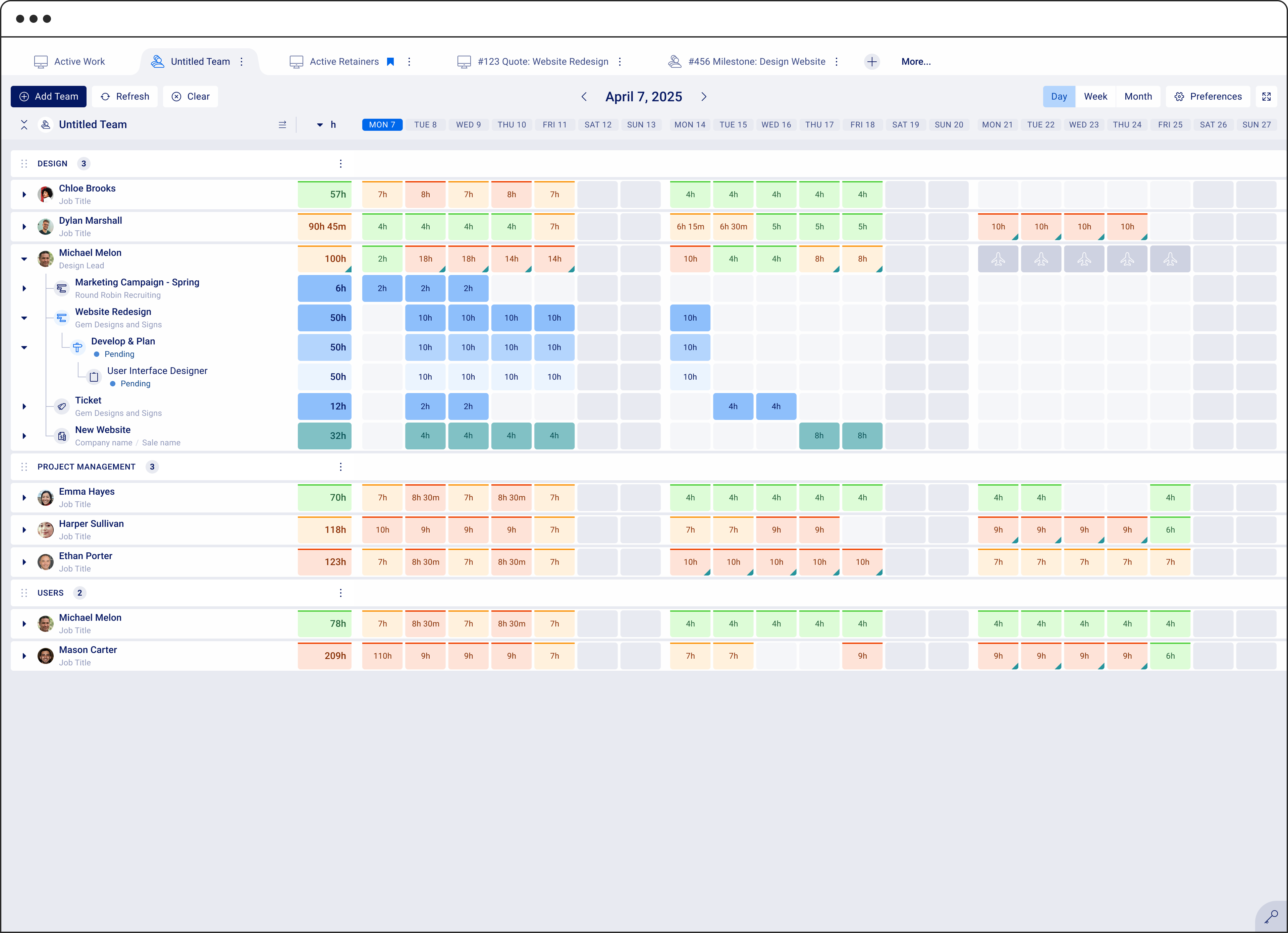
We also made sure those tentative plans appear clearly on the Schedule Dashboard, so everyone stays aligned.
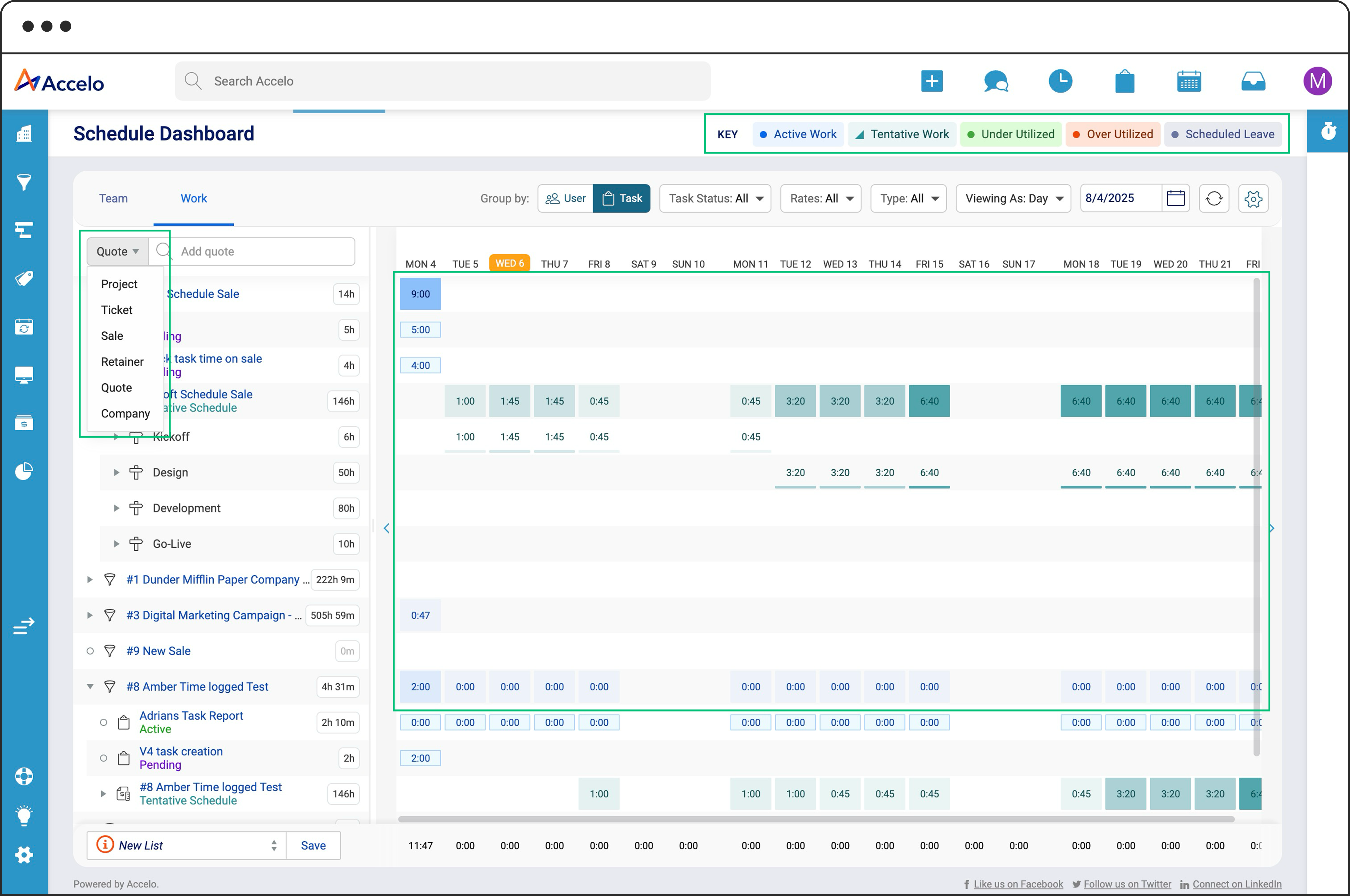
Active Schedules (existing) in blue, Tentative Schedules (new) in Teal
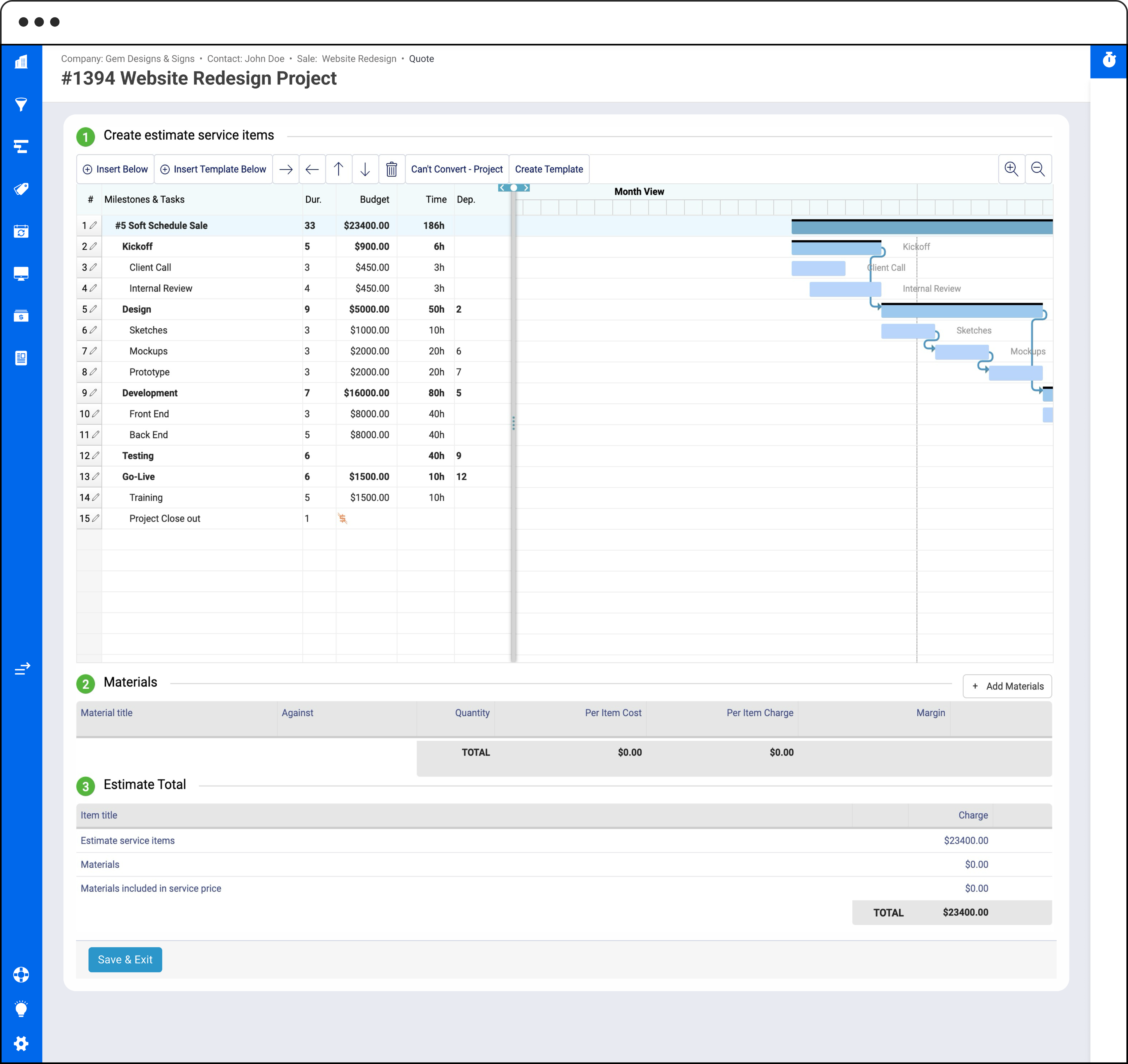
Create Quote Estimate Screen
Before

Because Quotes don’t support tentative dates, they can’t be shown in the Scheduling Dashboard.
After
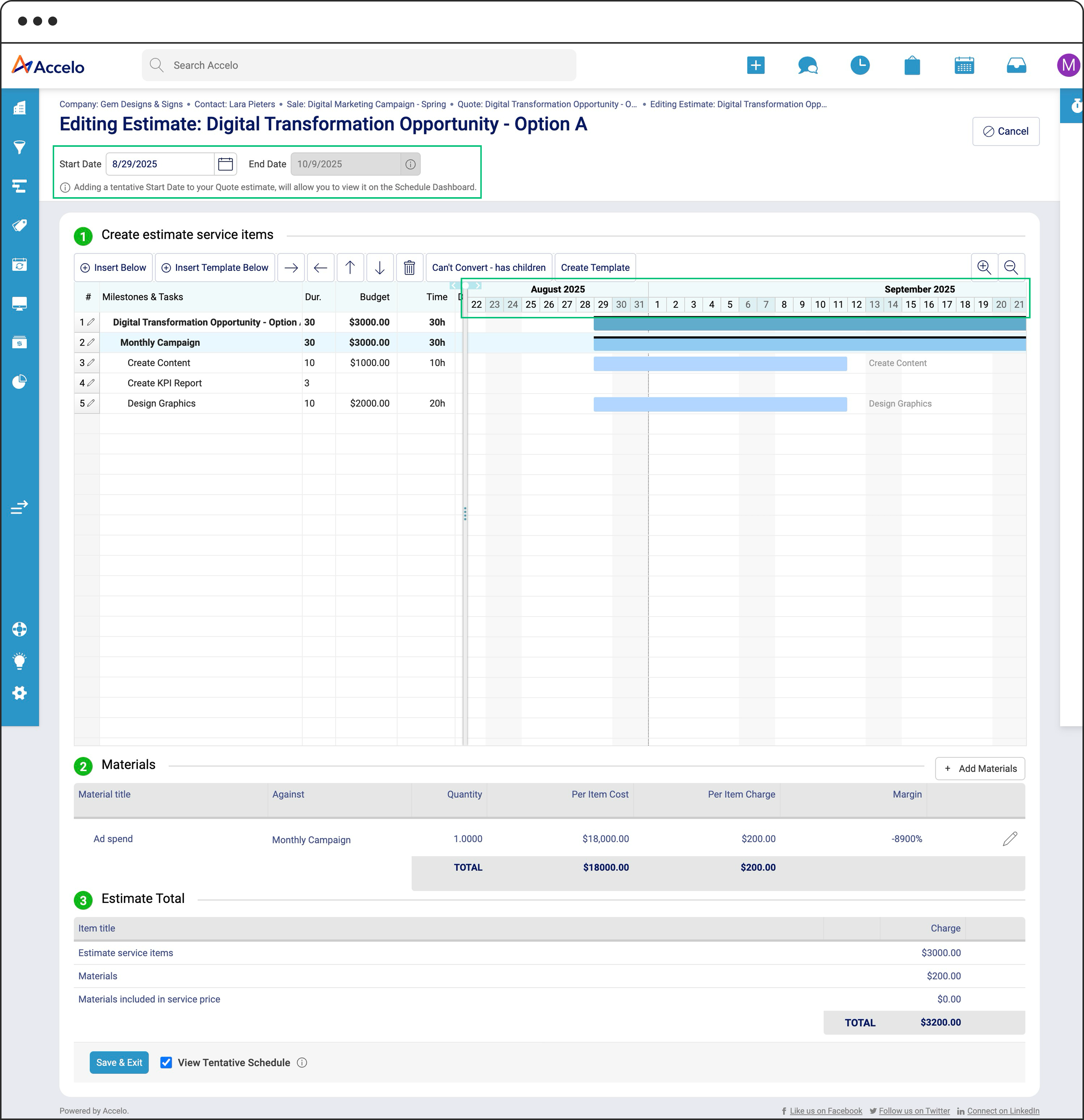

Users are able to define a Tentative Date, and the corresponding timeline is displayed within the Gantt chart view.
Schedule Dashboard
Before
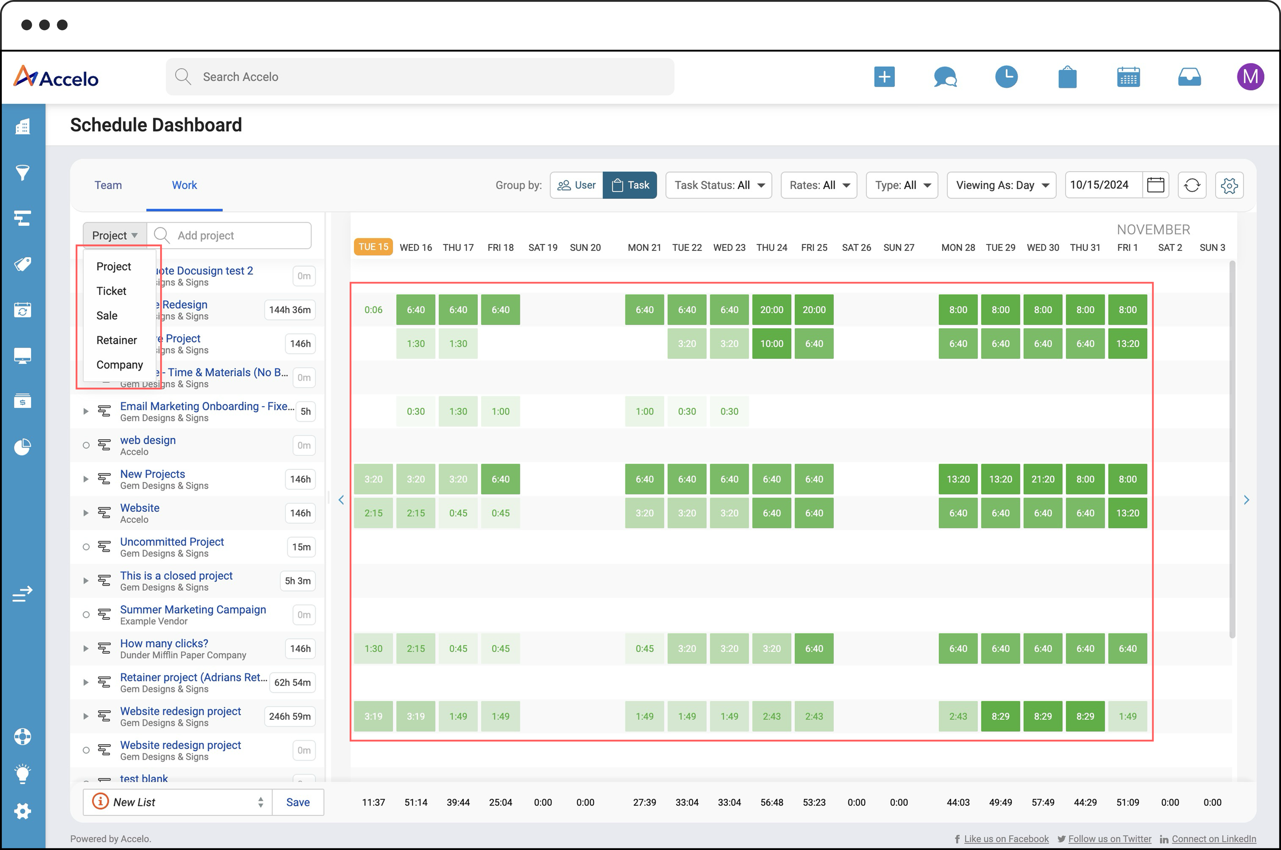
No way to view Quotes in the Dashboard and only uses single color
After
There is currently no way to display Quotes in the Dashboard, and they are limited to a single color representation.
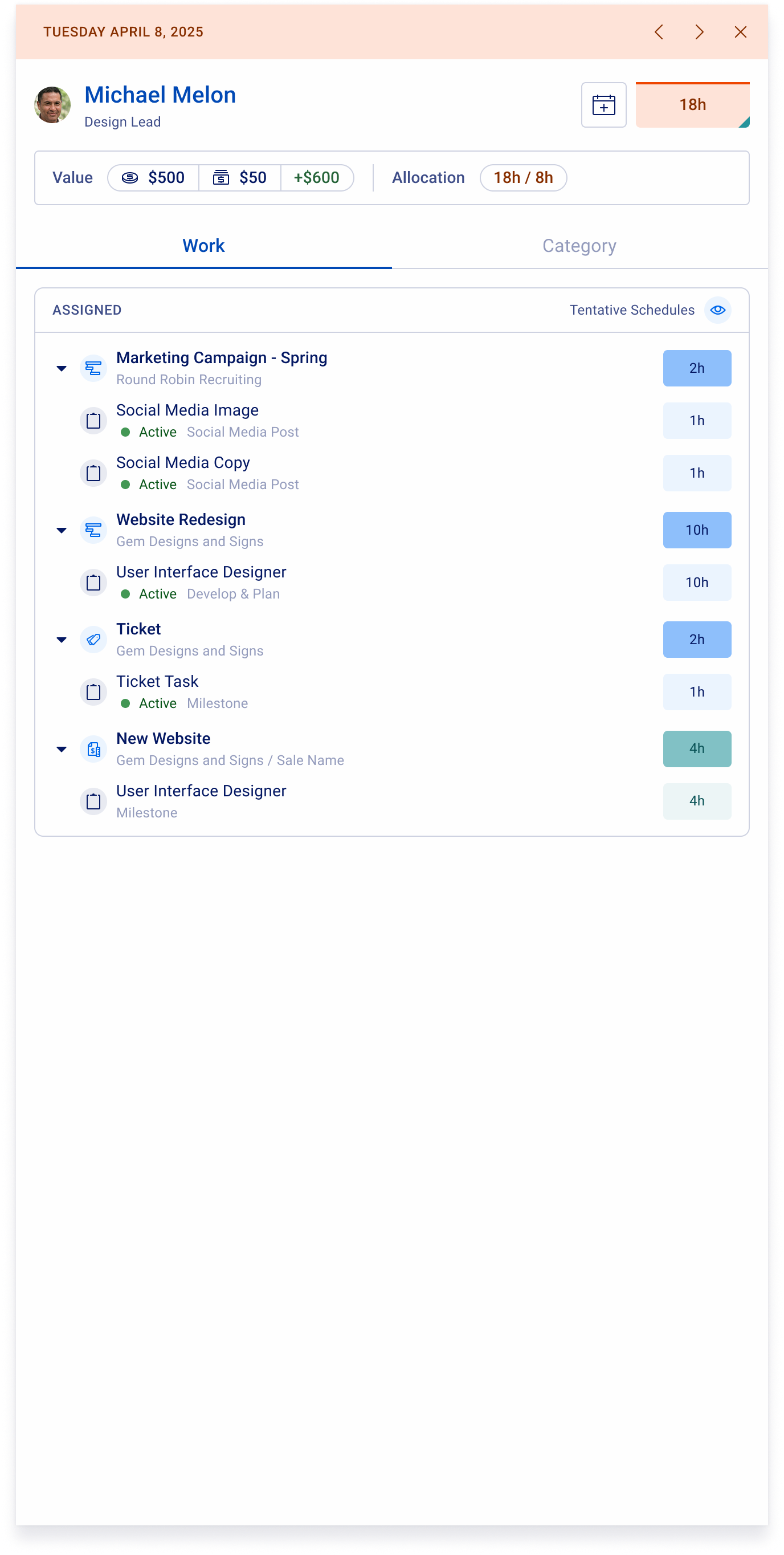
Schedule Dashboard Drawers
Before

Without tentative schedules in the Dashboard, the drawer's user section can't reflect them in the user's allocation.
After
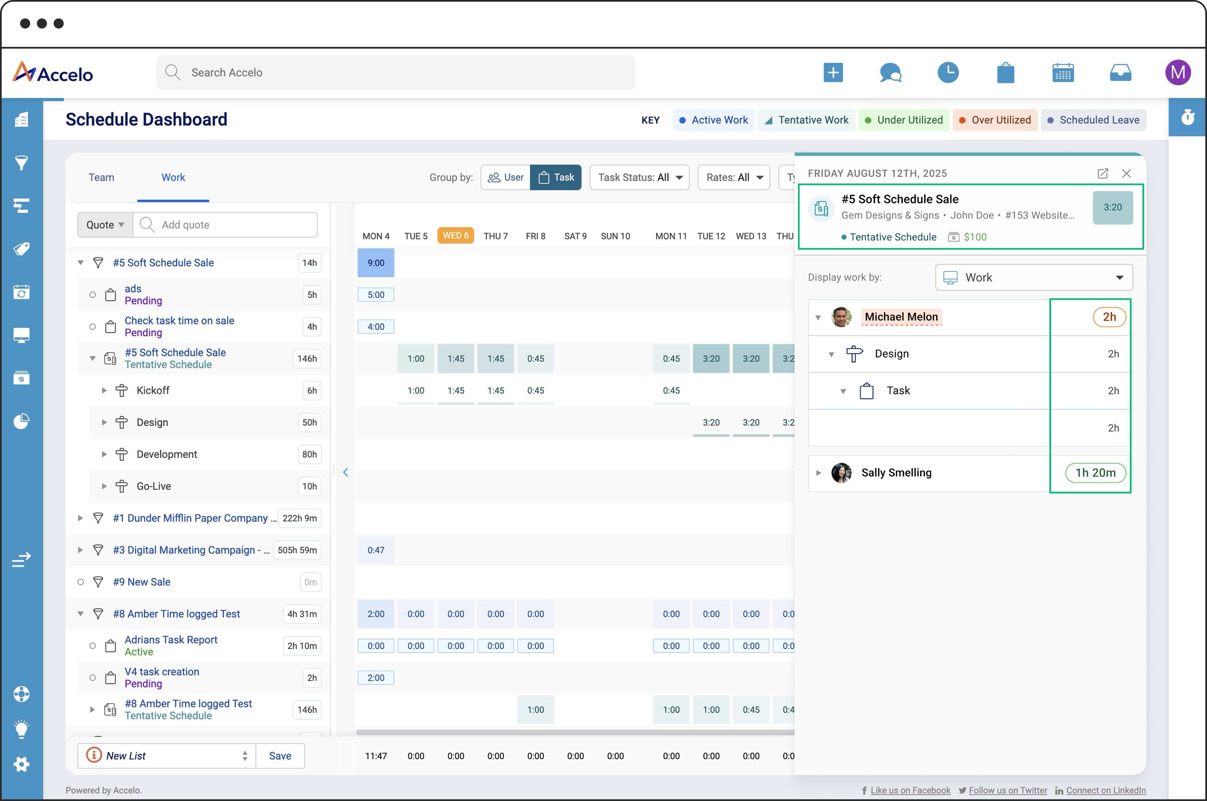
The drawer provides a detailed view of tentative schedules, with user time visually distinguished through color coding that reflects allocation sentiment.
Phase 1 had a limited scope and a faster delivery timeline, as it was built on top of the existing legacy screen. This meant we couldn’t explore changes to the look and feel—instead, the focus was on delivering core functionality quickly so users could start trying it out as soon as possible.
Phase 2: A Smarter, More Visual and Modern Schedule Dashboard
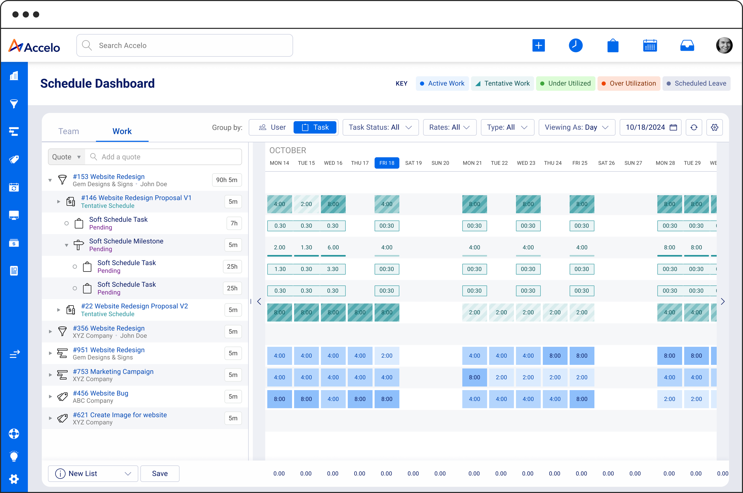
We’ve modernized the Schedule Dashboard to make it easier to see who’s doing what, when, and where. Key updates include:
- Enhanced Team and Work views, designed for better clarity and usability.
- Improved visual indicators for capacity, making it easy to identify when someone is overbooked. We’ve lev
- New tabbed navigation for quick access to multiple lists.
- Work items now nested under users, making associations easier to understand at a glance.
- Enhanced search and filtering, with support for Custom Lists.
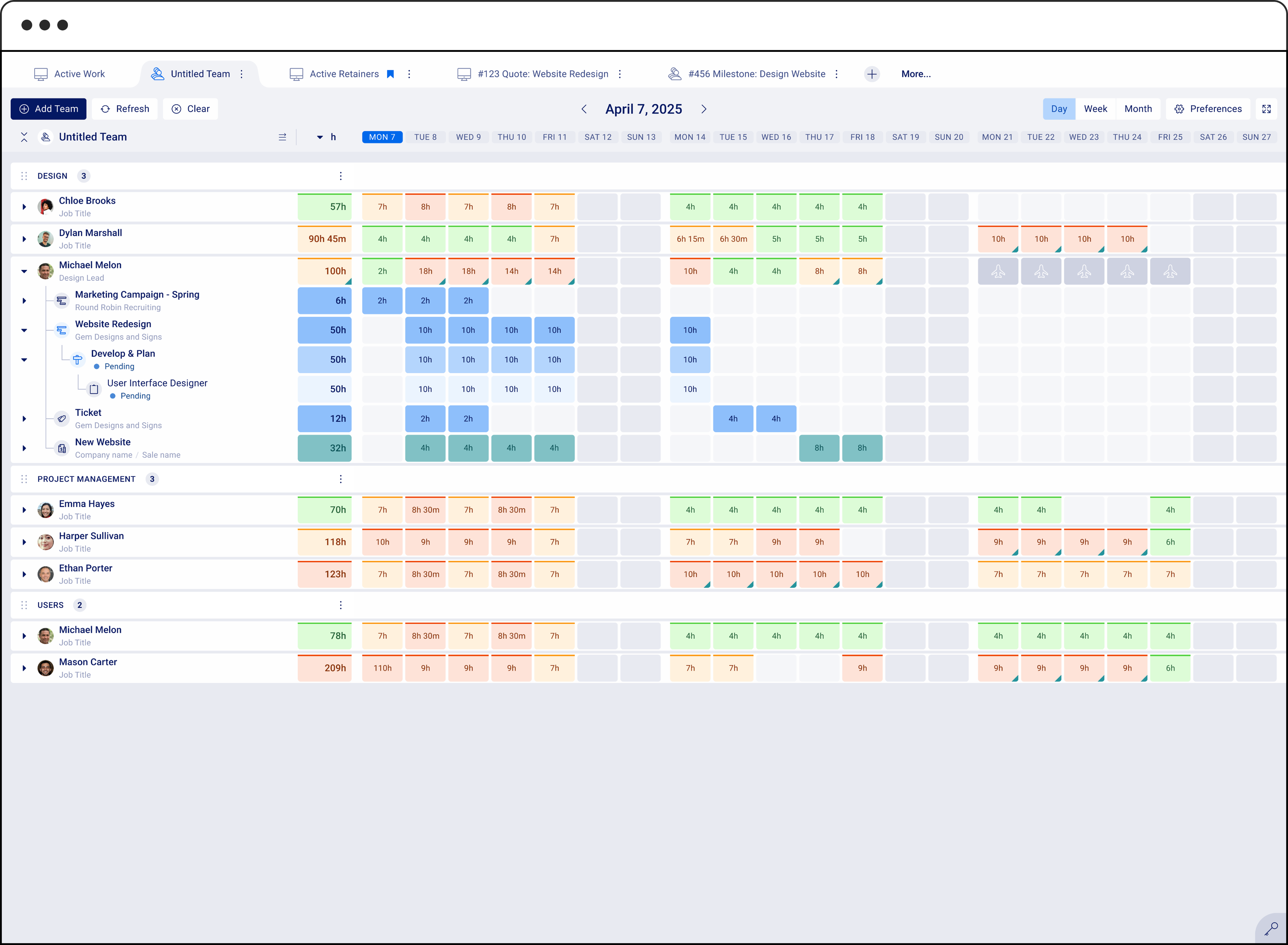
Team View example displaying Active and Tentative work items organized beneath each user.
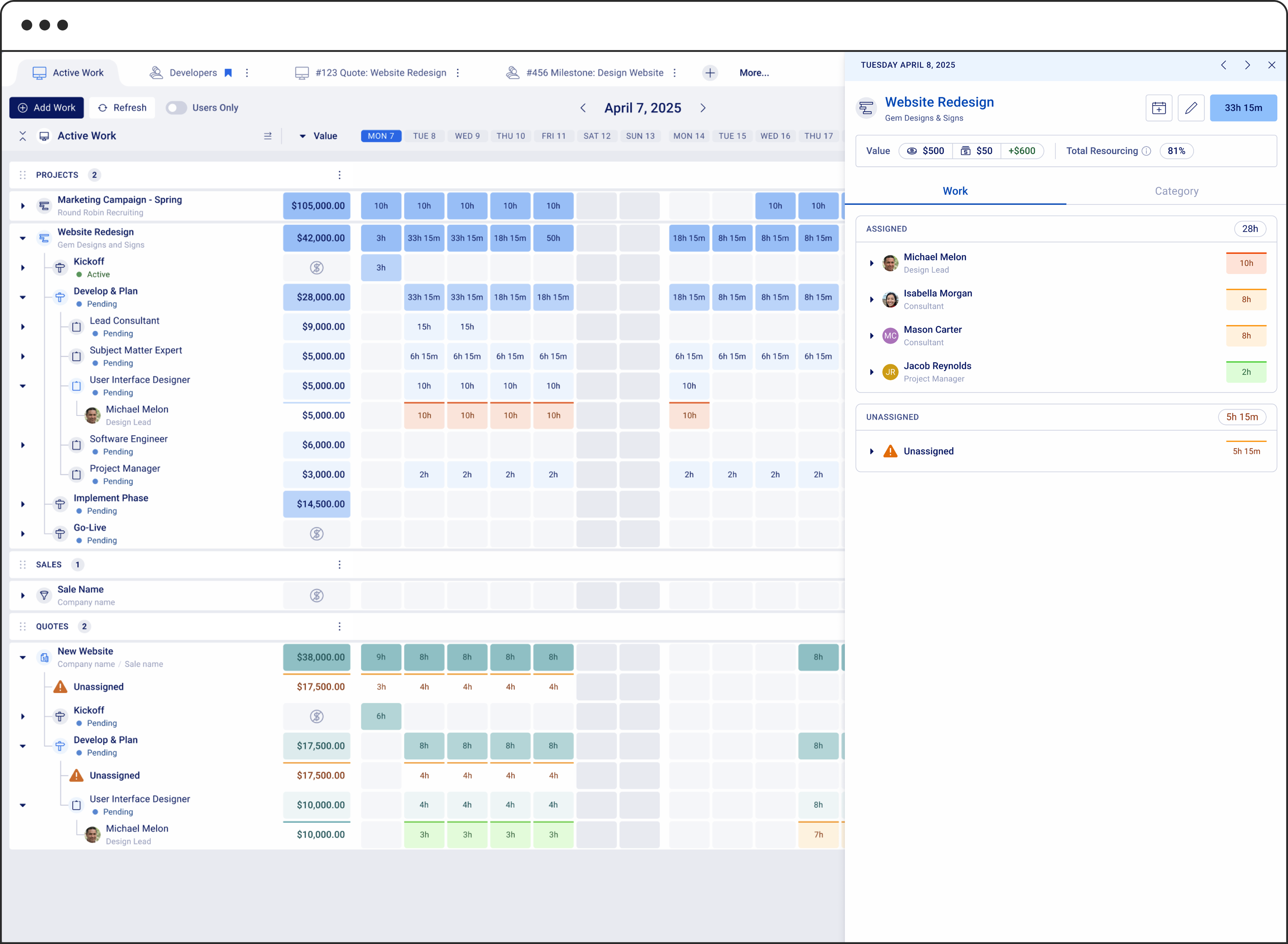
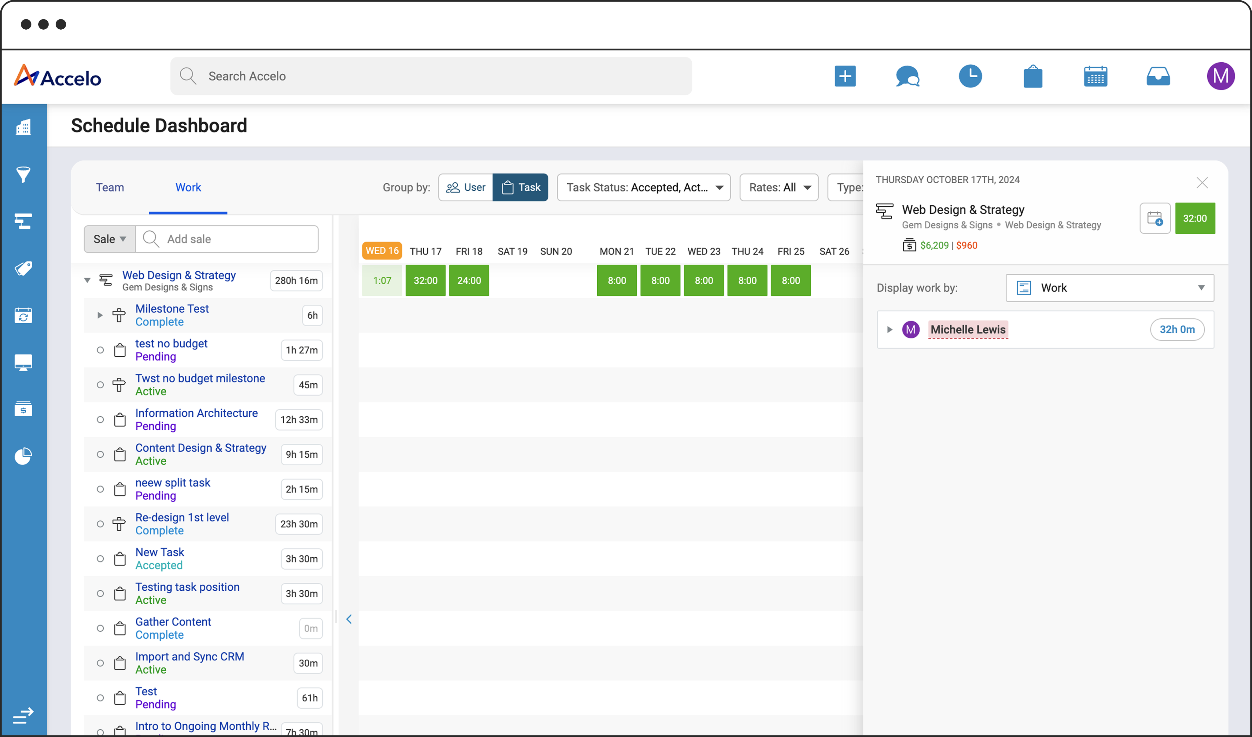
Example of a Work View with an open drawer. The drawer provides additional context about the individuals assigned to the selected work item, using color cues to show whether team members are under or overallocated at a glance.
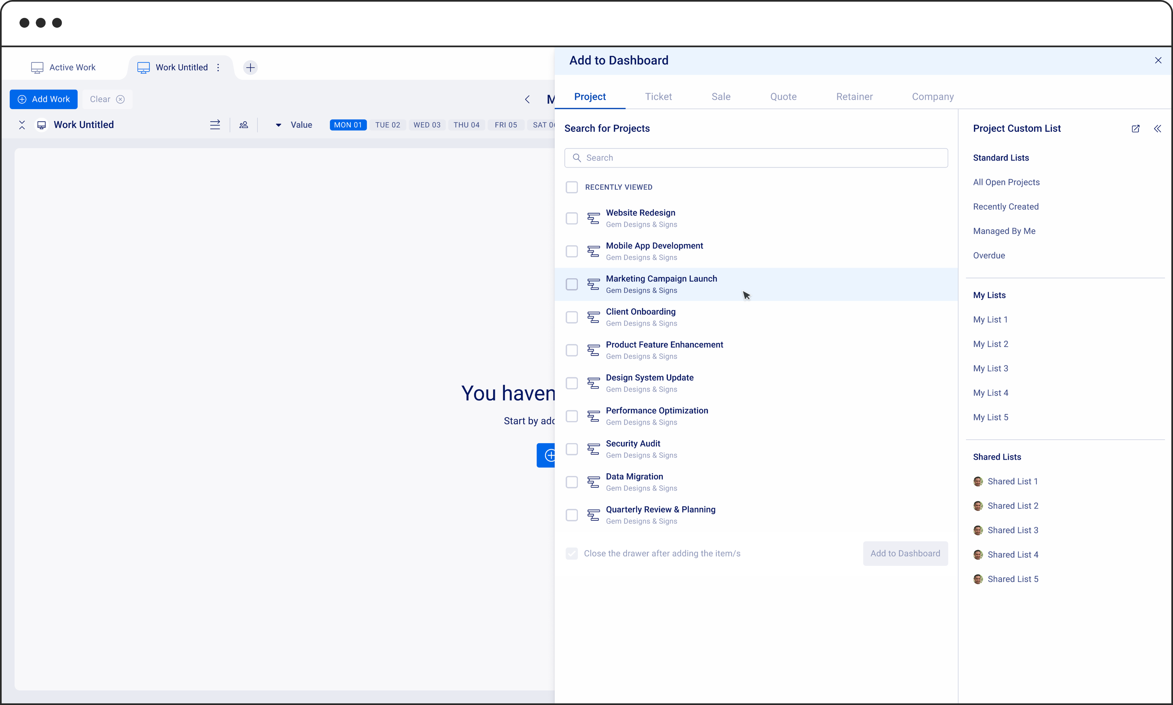
A new drawer experience for adding work and users to the dashboard. In addition to manual entry, this update introduces the ability to use Custom Lists, a feature users are already actively leveraging.
Phase 2 was an exciting opportunity to explore new ideas, as we weren’t limited by legacy screens. With a fresh tech stack and codebase, we had the freedom to modernize the page in more impactful ways.
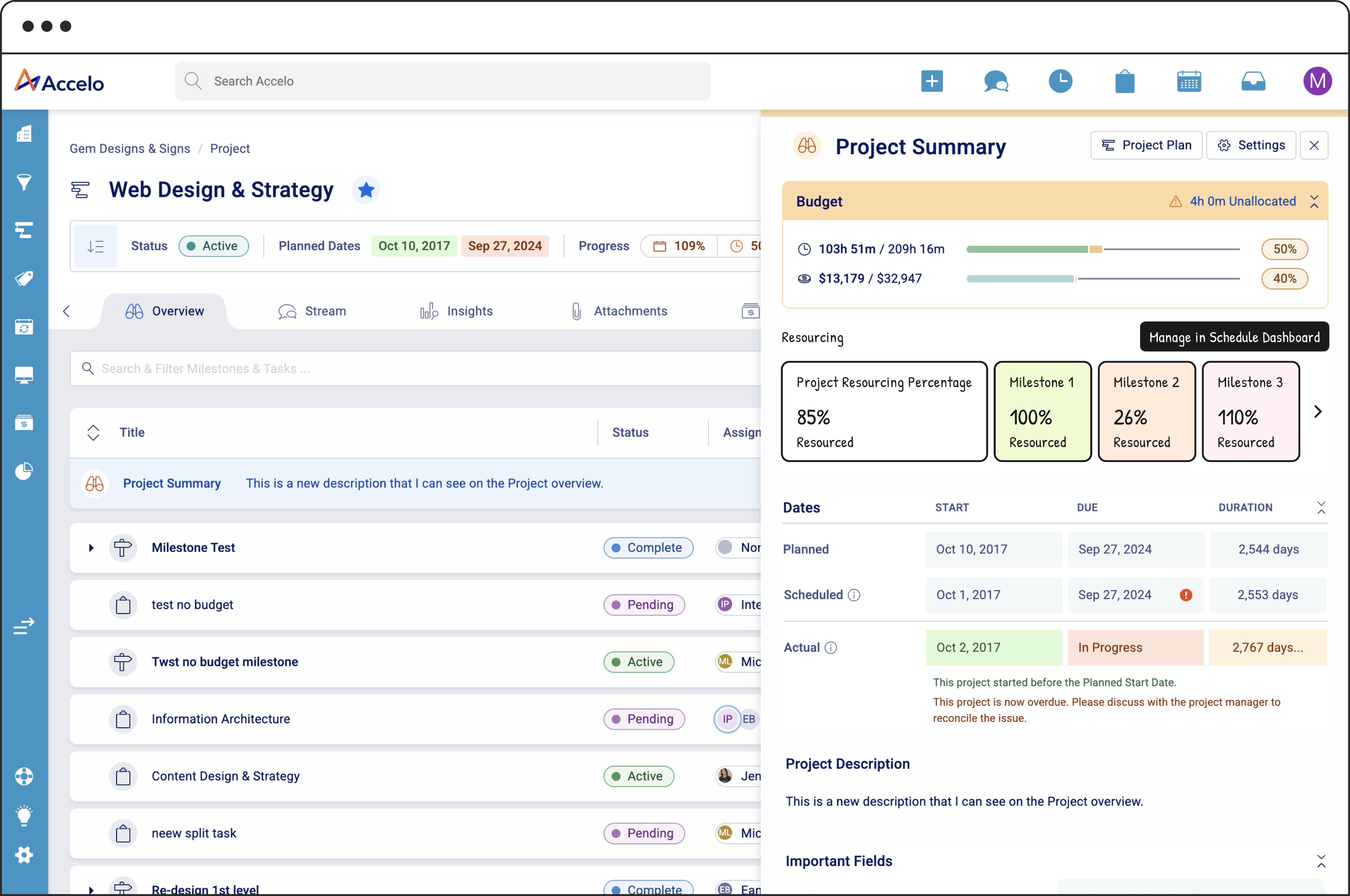
Phase 3: Reassignments, Group Planning, and Smarter Suggestions
In this phase, we focused on solving the challenge of reassigning work and balancing team workloads. My role was to design the wireframes and prepare a presentation for stakeholders to see the proposed experience. Here's what we introduced:
The ability to assign work to Groups, not just individuals
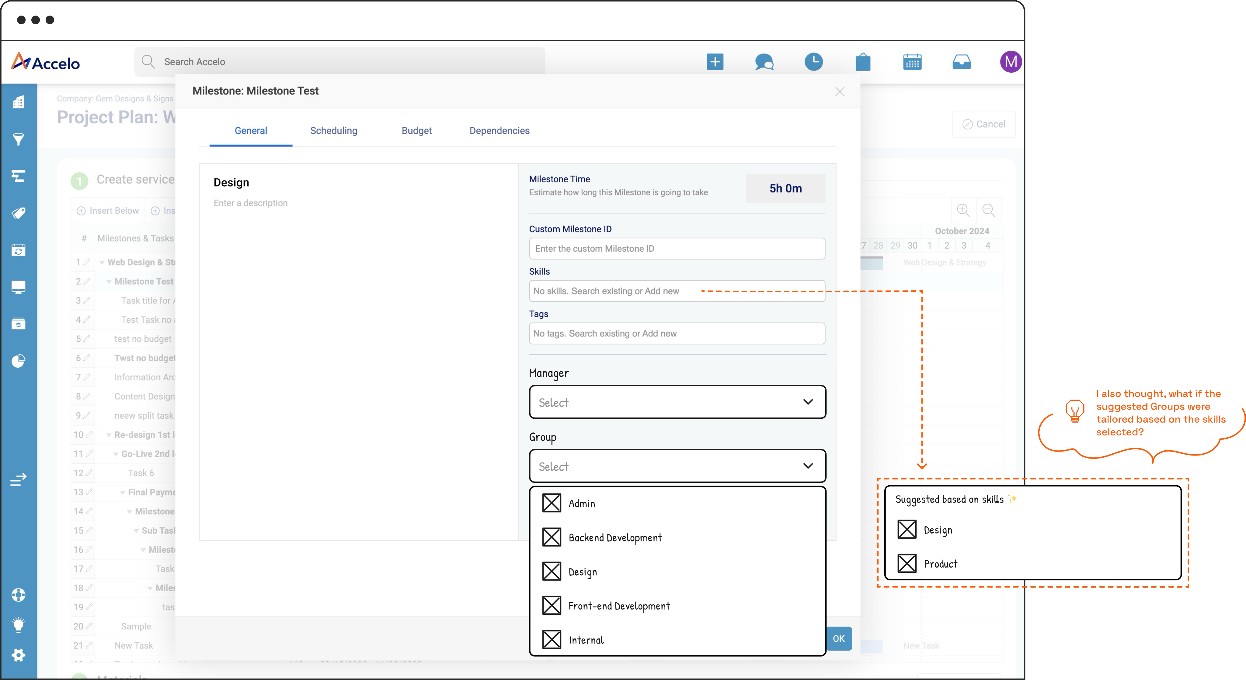
Actionable suggestions for improving team distribution
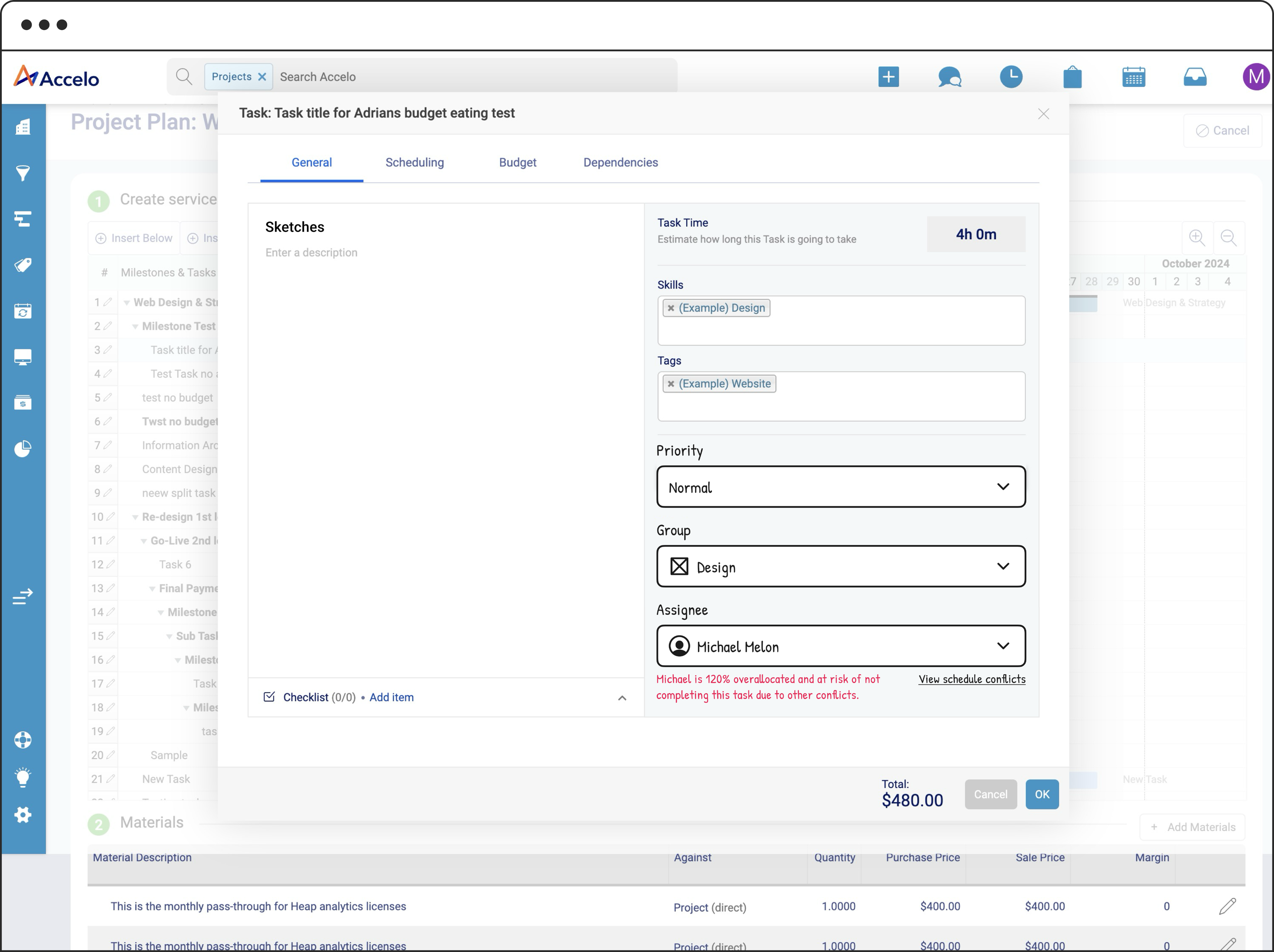
A summary view of resource allocation that highlights gaps or overloads
And coming soon: AI-powered project scheduling, where users can generate a project plan based on specific needs and constraints
Next Case Study

